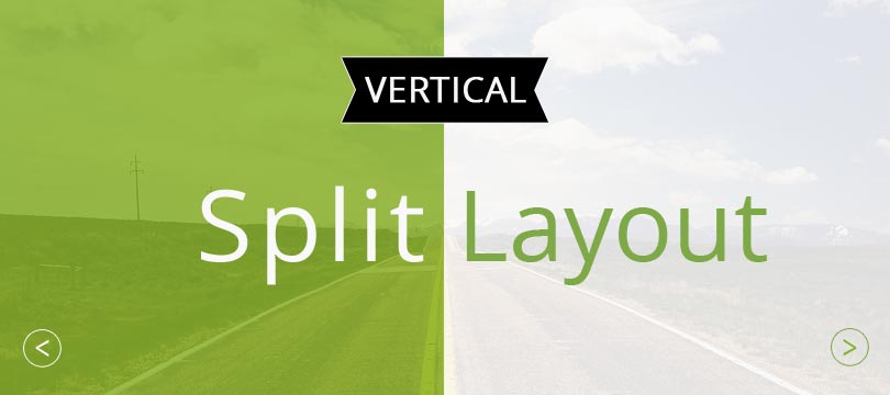
Vertical split layouts or split screens have been popular in web design for some time. They divide the layout of the website into two halves and can thus draw the user’s attention to two elements at the same time. Moreover, well-made split layouts are a real eye-catcher and offer a lot of space for creative and targeted designs.
What are Vertical Split Layouts?
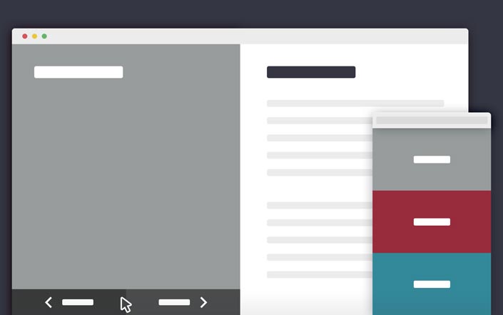
In a split-screen layout, the entire height of the screen is divided vertically into two equal halves. This allows two different content areas to be displayed side by side and thus equally.
When to Use Split Screens:
Fancy web designs such as full-size and video backgrounds, but also split layouts are not suitable for every web project.
A split-screen design is particularly effective in the following cases:
- when two products are to be advertised at the same time
- a product is sold in two variants
- services are offered for two different target groups
In these cases, the striking layout could possibly also have a positive effect on the conversion rate of the page. Instead of the classic landing page style with two relatively small call-to-action buttons, a split design is certainly more interesting and clearer. After all, the visitor only scans the content and then makes his decision within a few seconds.
Vertical split layouts can of course also be used just for fun or to visually enhance your website. Split screens are therefore especially popular with creative agencies or portfolio websites.
Advantages of Vertical Split Layouts
- Two elements can be presented visually with equal weighting
- The user can choose between two options at first glance
- Original and eye-catching design possibilities: Play with contrasts, symmetry, colors and typography
- New ways to guide the user through the content
Disadvantages of Vertical Split Layouts
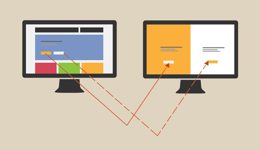
Split screen layouts, while responsive, work best on large screens. On smaller devices like cell phones, the columns are either too narrow or the two halves are positioned below each other instead of next to each other. This cancels out the desired effect of two elements of equal value.
Websites Using Split Layout
Desktime
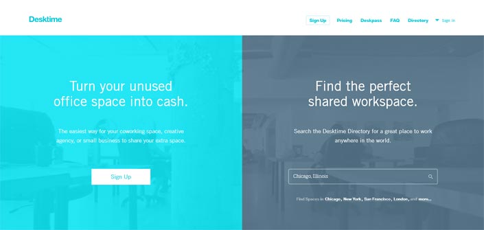
Desktime uses the Vertical Split Layout to address two target groups at the same time. On the left half office space can be offered, on the right side of the screen the user can search for vacant offices.
Unfortunately, the layout is no longer online.
Dropbox
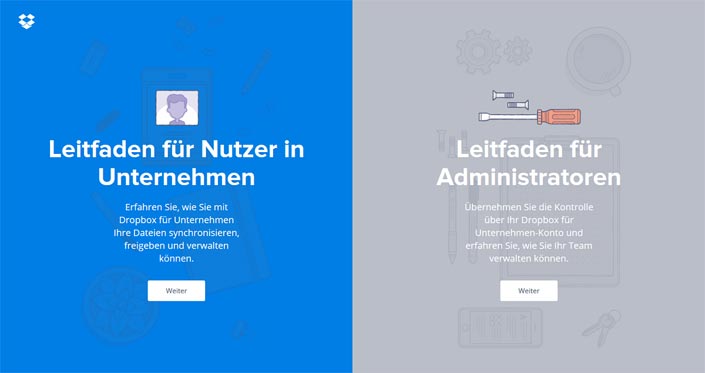
The Dropbox Guide page also prominently addresses two user groups equally. They can find the right guide at first glance or click. In the meantime, however, the page has been redesigned again.
Carel + Piet Hein

Unlike the previous examples of vertical split layouts, Carel + Piet Hein does not simply split the screen visually.
The website presents the two entrepreneurs on an equal footing next to each other. And with a mouse click, the layout shifts in the corresponding direction. By scrolling, you then get detailed information about the respective person.
Pomo Pizzeria
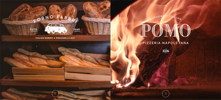
Bread or pizza? Both offers are prominently featured here and provide all further information via click and scroll. The detail pages are also a delight to look at thanks to well-made video backgrounds!
Juan Mora
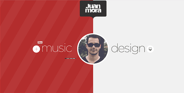
Right at the start of Juan Mora’s website you can choose between his two main focuses: Music or Design. Depending on which side of the screen the cursor is placed, the color and the photo placed in the center changes.
kirichik.com
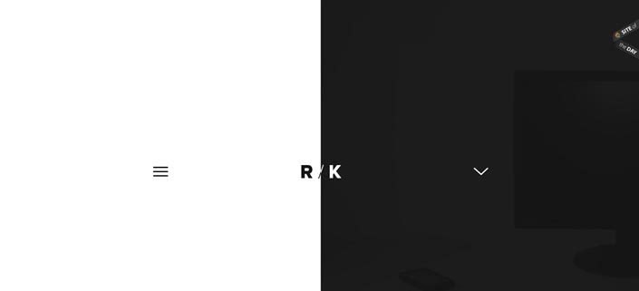
Roman Kirichik’s website is very minimalistic and relies on a b/w contrast.
LS5
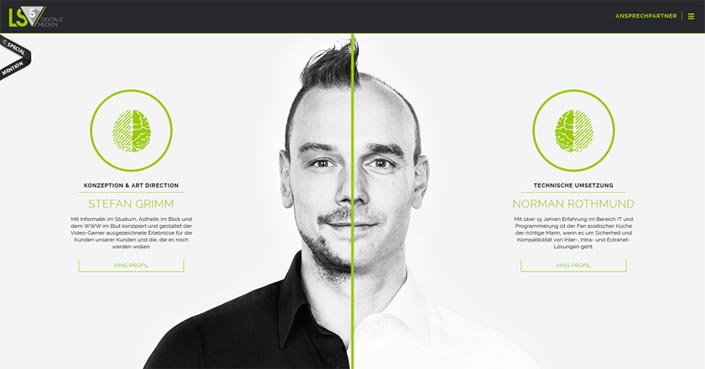
In the case of LS5, one half of each screen displays brief information about the creative heads of the agency. In keeping with the split layout, the portrait photo was also split and given a winking hover effect.
Studio Meta
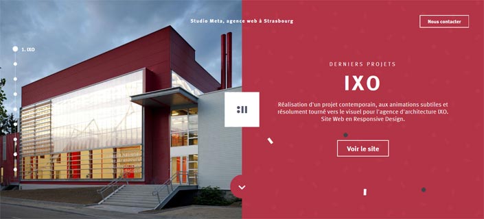
Studio Meta presents its portfolio with the help of the split layout: on the left a meaningful image, on the right a short project description.
Peugeot
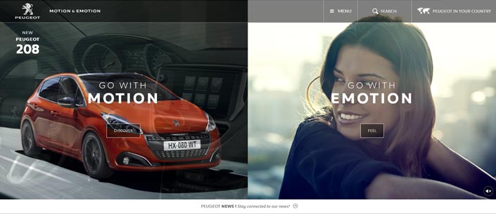
Peugeot cleverly visualizes the Motion & Emotion slogan with the split layout. Depending on the area clicked on, the visitor is offered different navigation options.
New-Letters
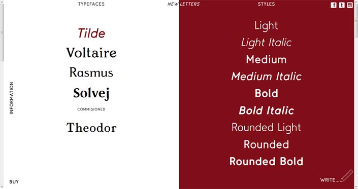
The available fonts are displayed on the left-hand side of the page and the respective font examples are shown directly next to them. If the user selects a font on the left, he can also enter his own text on the right screen.
Papplab

Papplab uses split screen to present past and current projects.
Technical implementation of split layouts
So far, vertical split layouts are more of a web design tendency than a trend. Therefore there are not yet many tutorials, templates or WordPress themes with these features. But I could find a few sources on the topic:
Split Layout Tutorial
The tutorial from Codrops includes a demo with two variants and detailed instructions for a split layout. When clicking on a page half, the layout shifts in the corresponding direction with a nice transition effect.
2 Blocks Template
Inspired by Dropbox’s split-screen website, Codyhouse provides a split layout template. There is a tutorial and of course a live demo.
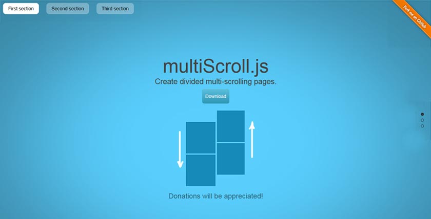
A jQuery plugin for multi-scrolling web pages with a vertically split layout.
Conclusion:
Meanwhile, almost every website (like mine) is built according to the same principle:
Underneath the navigation there is – 90 percent of the time – a slider, sometimes also a hero header. In this area you can find an introduction text and usually one or two call-to-action buttons.
If this design pattern is too boring for you, you should take a closer look at the examples and possibilities of split-screen layouts.